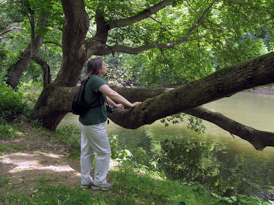
wood type

Above and Below

It's June already! I've been working on some new letterpress prints, including this one titled, Above and Below. This is a continuation of the Small Fires series, an ongoing body of work that explores pictographic images as modes of communication. These prints are all handset with wood and metal type and printed on a Vandercook No. 4 Proof Press.
 
:: setting the type for Above and Below ::

:: detail :: 

 :: detail ::

:: Above and Below, 2013, 14.5" x 22", letterpress on cotton paper ::

This week

This week has been an interesting one with unexpected opportunities and surprises. I won't give away the secret just yet, but I will say that my studio will be featured in totally unexpected, and very cool, way. On film...

I've been working on prints for this mystery project.

 :: mystery words ::

 :: more mystery words ::

This week. I keep looking at minerals! I don't know what it means yet, but I'm fascinated how minerals mirror larger geological, meteorological, and other natural phenomena.

 :: a mineral disc ::

 :: more minerals ::

:: go forward ::

New Year, New Projects

I have a new print available for sale now on my website, titled Small Fires. The composition is set using wood and metal type (no polymer plates). It's inspired by pictographs from arctic cultures.

This print is also a part of my design process for the new book I'm working on, which is about my personal mythology of the north, an idea I started back in the summer and mentioned here. I'm excited to finally be working on the design and writing of the book in earnest now, my sense of purpose renewed.

:: Small Fires, Letterpress, 2012 ::

 :: detail ::

 :: detail ::

Available here

Cards and Experiments

:: the tricky little lock-up ::

I printed some new business cards for myself last week. To save money, I set the card on wood and metal type instead of getting a polymer plate and printed the cards on scraps I had gathered from previous projects. Setting the type and getting the composition just right took some time, but the printing was quick and easy. I switched colors a few times for variety. To make them more versatile I trimmed them long and narrow so that they can double as bookmarks and price labels for books as well. 

:: done and done ::

I also did some polymer plate experiments on my Chandler & Price, Junior. So far, I've only printed wood and metal type on it. Polymer is a little fussier and I was worried the results wouldn't be so great. I set up a variety of plates, a halftone, a block of large text, and another much finer lined text. Not bad at all, these aren't even the recommended deep relief polymer plates. 

:: nice ::

:: very nice ::

:: little over inked, but nice! ::

That's a relief. Good job little C&P. 

Mysteries

Sorry for the long radio silence. I was traveling and now I'm back in Philadelphia. Unfortunately, while I was away, the internet at the house stopped working (I'm looking at you, starts with V ends with N) and it won't be back until September 1st (I'm giving you the stink eye right now, starts with V ends with N). Therefore I'm forced to broadcast from an unknown location.

Until things are back to normal, enjoy these mysterious images.

:: justin berry ::

:: kevin appel ::


Green Days

:: that's my mom ::
Summer is here, the trees are green, and so is the new typecase! Last weekend, I visited my parents in Delaware, we took a walk in Brandywine Creek state park. I live in South Philadelphia, where apparently they hate trees for reasons I will never understand. Going to Delaware is a nice change.
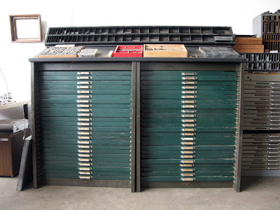
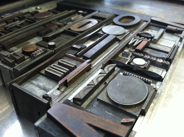
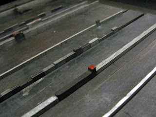
:: that's my new typecase ::
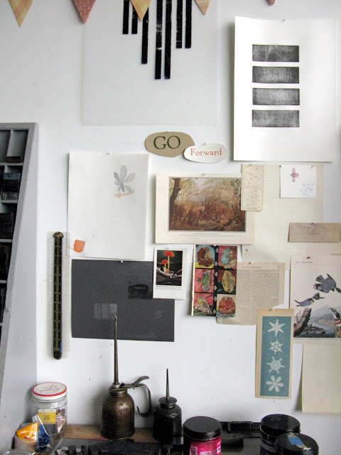
Last month was very productive. I spent a lot of it cleaning and rearranging the studio, which certainly is looking better than before. I also made my 
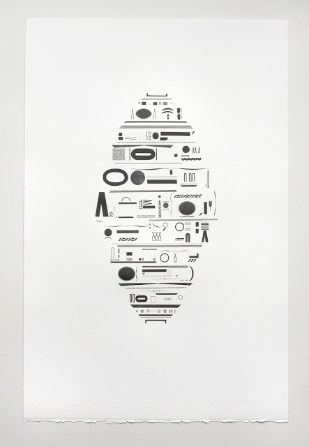
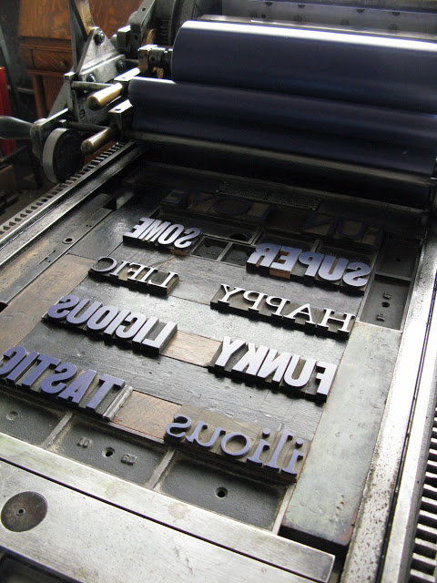
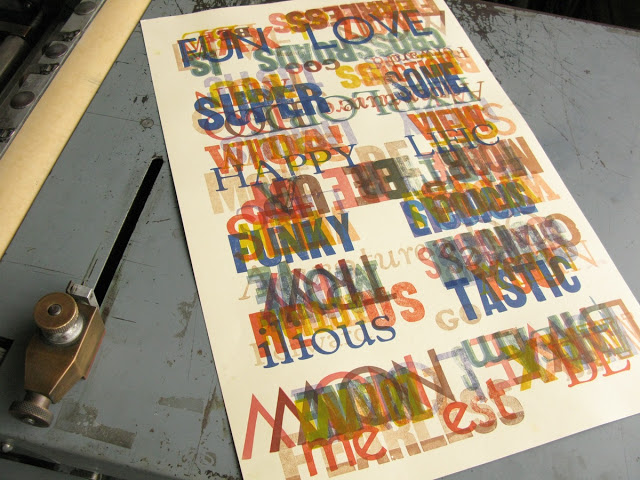
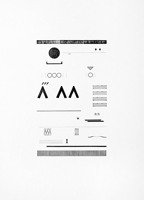
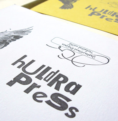
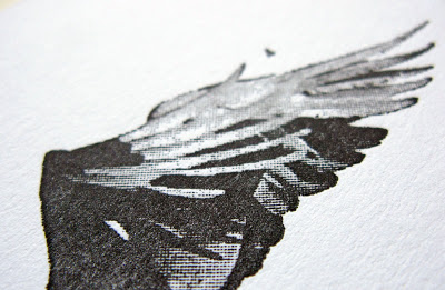
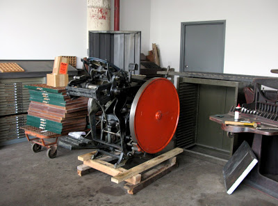
first test print on the press. To give you an update on the press, all that needs to be done now is

- reattach the feed boards
- figure out where it's going to sit in the studio
- plug it in!

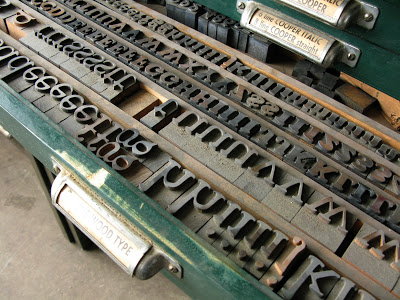
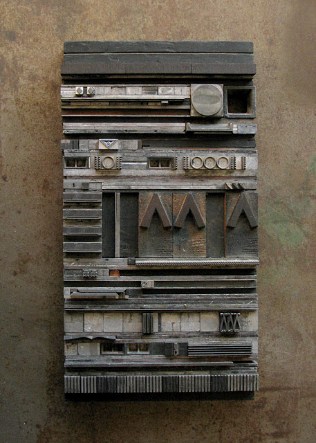
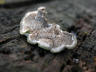
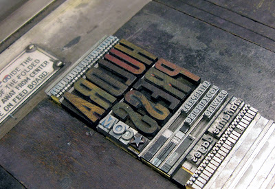
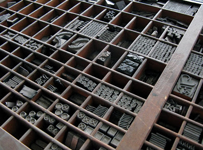
:: that's the Cooper wood type in the back that I'm dying to use ::

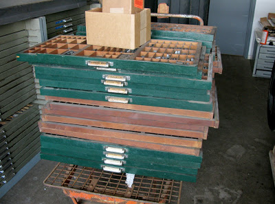
I'm so happy I bought these type cases. I didn't really have the room for them, but now that I've sold my old typecase and the galley cabinet, I know I made the right decision. Look at all that wood type!

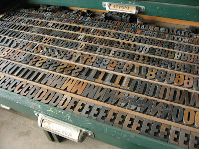
:: and that's more wood type ::

Things are looking pretty good. There's days where I feel completely overwhelmed, but I know I'm doing something right. I just need to be patient.

Before...

Press Month began on Sunday with the addition of a two new type cases to the studio. As you can see in the photograph below, I have not yet found space for said type cases...It looks like I will be playing a little studio Stackenblochen.

:: Type Type Type! ::

But who can resist type!

Borders, ornaments, and oh so much more...

...and glorious, glorious wood type.

No, I couldn't resist. This means though that I am cut off.
That's it. No more. My 500 square foot studio has reached capacity.

By the way, this month, I'll be selling a single type cabinet (with type) and a galley tray cabinet, that also contains type, dies, and spacing material. You, dear readers, have first dibs. Please email me if you're interested.

So here we go, Press Month begins, and I submit to you this "before" picture, and we'll see where we are come June.

:: before ::

Everything's Coming up Milhouse!


:: wood type and cat ::

I went on an adventure yesterday, to meet a fellow with some letterpress equipment for sale. I came back with a big box of wood type! The seller and his wife were very sweet, and I spent an hour getting to look at and talk about all kinds of interesting things. Searching far and wide for letterpress equipment can be a thankless pursuit, so when you meet honest, kind people who just want to see the stuff used, it's just swell. Yes, everything is coming up Milhouse, indeed.

The Thrift Store Dream


I have a recurring dream about the thrift store. I go to a thrift store I've never been to before. I look around. I rummage. And I find the most incredible, beautiful things! Old photographs, wood type, old ledgers and journal, a small press maybe. And I take it home, and then I wake up and hope, hope, hope that they'll be there. Well, maybe someday I'll find that cache of wood type in the sky.

:: pretty drawers ::

I brought home my new type cabinet last weekend and spent some time looking at what was inside. My favorites are 14pt Stymie Light, 12pt Pabst Oldstyle, and a sans serif simply named Airport. I'll have to do a little more research on that one. Last but not least, a humble little drawer of wood type!

:: wood type ::

I was also thrilled to see this again.


It's a short film about the making of crayons and when I saw it, I had a Proustian moment of childhood memories. I can't really explain why, but I believe this film has a lot to do with who I've become, someone who makes things.

POST spelled backwards is TSOP

That is what I found out after printing a proof of my new postcards and realized I'd set the letters backwards. I did consider making TSOP cards. I do love TSOP. Love Train.
But I decided to go with the more conventional Post Card. This one will come in two color schemes. I think I'm going to do a series of cards like this with layers of type and ornaments.